Description
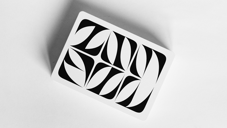
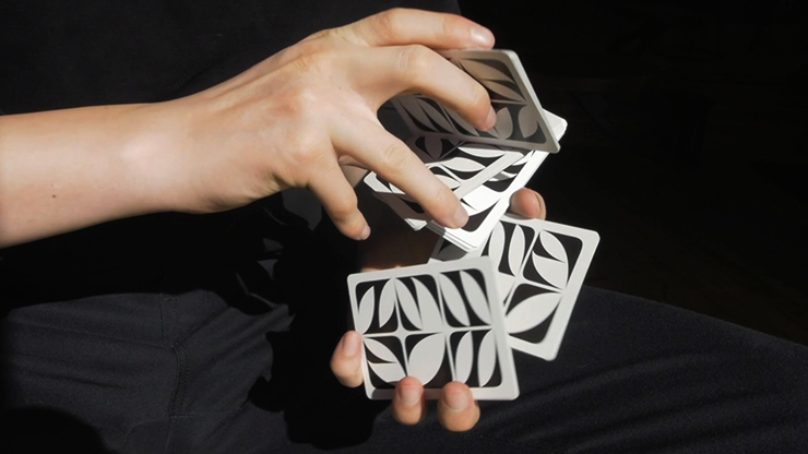
The overarching idea for Paperwave Glyph Edition Playing Cards was to create a direct comparison between all the different permutations of glyph (symbols or hieroglyphic character) combinations, and the endless amount of possibilities a deck of cards offers us.
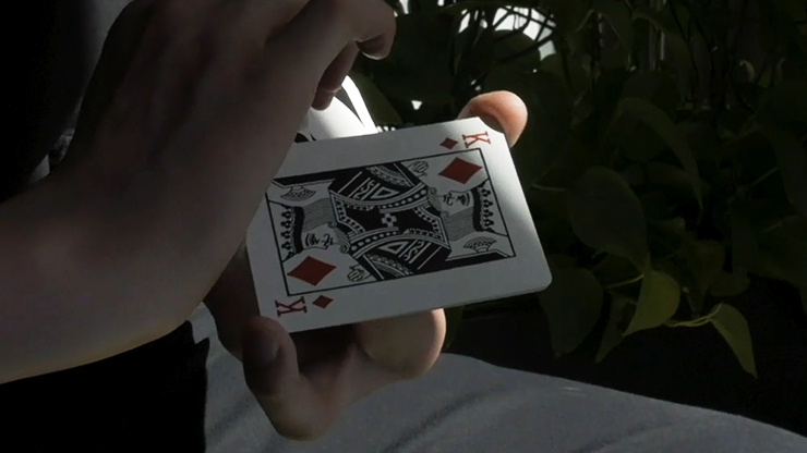
This design was born from a deep interest in typography and the search for unconventional typefaces that push the boundaries of form. I wanted to challenge the preconception of what a deck of cards can look like.
The typeface used as building blocks for this deck was designed by my friend, and talented French type designer, Charles Quirouard. From there, I adjusted its curves, proportions, and specific dimension to properly fit my vision for this design.
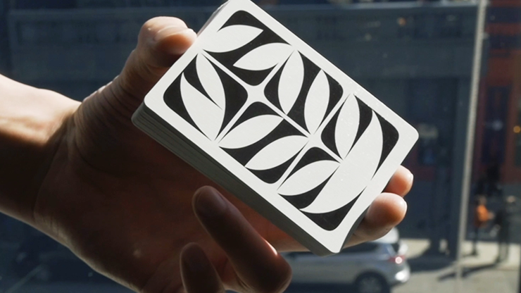
The moment I began experimenting with his typeface I realized it would look great as a back design. This quite abstract typeface has many beautiful moments that I wanted to highlight, but I couldn't include all 26 letters of the alphabet in one back without it feeling cluttered and chaotic. That's when the fitting decision of making a deck with 56 different back designs surfaced.
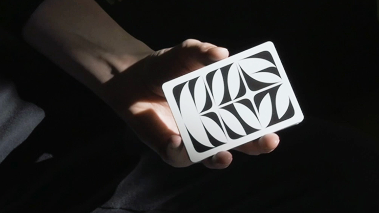
Every single back design of the Paperwave Glyph Edition Playing Cards has been carefully crafted to create a harmonious interaction between letters. This being a very abstract typeface allows for the letters to act more like shapes, taking legibility out of the equation, and allowing the viewer to focus on the forms and negative space this partnering of letters creates.
The 10 of clubs is my favorite card, and having the adapting slogan on the 10 of clubs on every deck is a special feature I will keep moving forward!
Estimate shipping
Payment & Security
Your payment information is processed securely. We do not store credit card details nor have access to your credit card information.

